I started a blog in order to show my thoughts and research during BA8 similar to my work in BA7. I wanted to have a area in which i could look back on any work I have done and see the development and be able to revert back to research. My goal was to post at the least 3 times a week and explain my work in detail on choices and changes I have had to make throughout BA8. It was also an area I post work i have done that is relevant to my course but not as important as my main BA8 project as that work would be important to show and explain.
I feel like i have maintained a good blog that i have regally updated with a few gaps where i have been busy. I have shown and posted many different drafts of work in which has gone through many different stages of development alongside, personal development work and research on some subject areas. Thanks to my blog I have also been able to always been in-reach of my work either at home or at uni. Some areas of my blog could have been better, or more formal and explained but overall it appears to be stronger than my last and it does show my work progression both BA8 and my personal development. The best areas are showing my work with John and my Showreel development as in both areas I have shown what I have designed and planned to do as well as the development of that work.
I feel confient that blogging is a key area of design as it hub of information you can personally rely on and that you can see the effort placed into work by the different stages of design. I will continue this practice outside of University.
Saturday, 19 May 2012
Friday, 18 May 2012
Last day
I had a short 1- 1 with my tutor today in which a couple of mistakes and areas I could improve on were discussed. Firstly my showreel needed to include a reference to the music i used. I used a Loyalty free soundtrack from www.Sounddogs.com. The track was called Oasis. Also on the showreel I needed to change BA Honours to BA (Hons) and there was jittering on the playback of my showreel which needed to be sorted. I was able to speak to another tutor in which the jittering was fixed by removing the image from the showreel, exporting the video then placing it into After Effects were I could replace the image and animate it without the jittering. It took time to do and it has increased the size of the file as i had to render and export it as a H.264 but it is better to have a cleaner showreel at a larger size than a unfinished version.
Another area I needed improving was my spelling and writing in my game document as there are many spelling mistakes throughout the document. Another issue was the colour of the text, due to my background changing colour the white text throughout my document was uncomfortable to read, i have now changed my text colour to make the document designed better for the examiner. I have also made my numbered points clearer to see as they faded into the text.
Today i also finished my personal practice pages as i wrote about what i have done to build myself as a game designer from competitions, student work, presentations and more. I put the information into a simple designed layout.
Thursday, 17 May 2012
Website, ready for hand in

This is an example of my website I have created to host a selection of my work for any potential employers to look at and see what I can do as well as see other methods of contacts to me. I created this website on tumblr a free web hosting site were you can use your own domain and design or use created themes to display your work. I thought that tumblr was a good choice because it is simple in design, I have the choice to change my website layout and style very easily as well as posting work takes seconds. I also means I can save costs and time designing then buying web space. Because I was able to save on money hosting a full website I was able to purchase 2 years worth of domain and i can continue to purchase the domain after the time has finished.
This is my submission image as it gives both the website domain, as well as an example of my website incase they examiners cant access the internet at the time of marking.
Business Cards redo


After making a first draft of a Business card on photoshop demonstrating that I am planning to use a QR code (Quick Response) I thought that I'd have another attempt at creating a business card. I was told by Matt from Jagex that a lot of designers or games industry employers like to pin up fun and artistic business cards up if they like the image on the card. Due to that reason I thought I should make a business card in my cartoon style that is different and quirky. I made 2 sides the card, the front has a creature looking down at my game and title and the back has a QR linking to my website as well as the website link. It's a simple design in which gives enough information for employers to potentially want to look at my work more.
I do like the design, however I also feel that I needs more work to make it stand out and get employers to pick it up. I also feel like i can make a better design that fits me as a person, i do still like the original version my business card and i may revert back to a similar style but have a more artistic look.
Wednesday, 16 May 2012
Monday, 14 May 2012
Showreel demo 2
Here is my new version of my showreel so far:
http://youtu.be/mBlWk-pwGWg
or
There are a few issues I need to fix in this showreel example, however I am also in the progress of completing my showreel. At the end of the showreel I have left time or some examples of gameplay of the demo me and john are trying to make. I need to remove the large section of black space in the video as that can be easily fixed by moving the render time back to the end of the video.
QR Code
As i made a design for a business card to help promote myself and my website I thought I could add a QR code. Today I bought my Domain Name for my website and was able to generate my own working QR code that links to my web Domain.
Here is the QR code:

Here is the QR code:
Showreel
Over the last couple of days I have been working on different things such as my main work, business cards and more and i have been thinking of how I could make my showreel better as although I designed a new background frame for my showreel I don't think its as good and I don't personally like it. I felt that it was missing a theme or the element that makes it different/stand out. I wanted another image for my showreel in my cartoon creature style so I designed this image (shown below) as another practice in illustrator as well as more to add to my art collection.


This concept was based around showing the audience that I have a lot of ideas thus being a lightbulb rather than the annta light. I quite liked the background and thought that I could break the image part and make it into a larger scale image by incorporating it all into my showreel. Now my showreel is based underwater giving it a theme that carries thoughout. I also learnt how to animate on Final Cut Pro and made a series of animations now out of images to make the whole showreel stand out.
I also had to create a lot my my images to fit this new theme and i did that using my art frames and interesting methods.
Examples:


Thursday, 10 May 2012
Business Card
As a quick thought on creating connections as well as getting people to visit my website i thought that having a business card that has a QR code will help people remember who i am and make them more likely to visit my website.
I had a brief look at business cards on the web as well as different and modern business cards. From looking around I don't have the necessary time to create business cards that are modern with folds or cut out edges but looking at some cards shows how a simple image with the basic necessary info is enough to look good. Here is an example of one I found I would pick it up if I saw it:

I had a brief look at business cards on the web as well as different and modern business cards. From looking around I don't have the necessary time to create business cards that are modern with folds or cut out edges but looking at some cards shows how a simple image with the basic necessary info is enough to look good. Here is an example of one I found I would pick it up if I saw it:
http://cardrabbit.com/cool-business-card-thinktank/
I did my own design of a business card, this is the first version and a rough copy:

Tuesday, 8 May 2012
Pause Menu
I saw John the other day and found out there was a lack of communication through our emails in which he didn't receive some files i sent over. This has slowed down the production of the demo for Nimbo however i was able to see the menu working on gamesalad. The demo looks great and mostly works which i am really please with.
I had to quickly make some more images for John to fit into the demo and make sure he got some other files i had sent before in which he didn't get. During this time he also said he could make a pause menu for the game so that its easier to get from the demo level back to the menu. While i was sorting out files and using photoshop i quickly made a pause menu with the necessary layers to drop straight into Gamesalad.
Here is the Pause Menu:

Friday, 4 May 2012
Showreel New Background and Design
Today I went over what I have done for my showreel. As I was told the other day that I need to improve my showreel and remove the clutter and distractions as well as add more character animations to the Avatar. I have had a new perceptive on my showreel and chosen to get rid of my avatar and to replace the background with a generally eye pleasing and relating framed background. Shown Below I will add this background to my showreel and see how well it fits the animations.


Thursday, 3 May 2012
Teeshirt and Merchandise
Today i have been preparing my merchandise for my final submission due to the upcoming hand in. I had planned out and got the materials for making merchandise however i didn't complete making them due to other projects and my main work being more important, however i don't want to waste the opportunity to make merchandise for my game concept as it will great to show in the project as well as to show and have in the degree show. All i need was to print out some templates so i can cut out the materials for a push toy, i also had a look at designing a couple different teeshirts today in which i could get printed.
Here are the designs:


Here are the designs:


I came into a issue when i went to get the teeshirt printed as i couldn't get it printed on a blue shirt unless each line of Nimbo was created by vectors as well as all had to be different coloured greys. The greys would have to then vary from darker to lighter and sliver would even have to be added. This may then make Nimbo look wrong or different. A compromise is to have the image printed on a white teeshirt which wouldnt look as nice but i would have a real teeshirt.
Wednesday, 2 May 2012
Group Crit
Today i had a busy day due to a number of different lessons, duties and work i had to do however it was also helpful and useful day as i have some new directions in which to take in regards to my showreel and written work
We had a group crit session today with 2 tutors, an industry ex student and a couple of other students where i had to show and discuss my project along with relevant points to submission and plans for degree show. It went well and i took up a lot off time showing all the work i have done so far, thus showing that i had a reasonable about of work done. I was worried that because of my strong change into working on personal practice it would effect my main project heavily.
The feedback given back was that i had a strong amount of work and i was on the right track, however there was areas i need to improve and change to make sure i can get the best mark possible. One area of improvement was my written work is full of spelling mistakes and grammar mistakes through-out all my work, but most of all in my blog. This means that i will have to go through my blog and correct many mistakes i have made to help my project taking an unnecessary negative mark.
Another main area that need to be worked on is my showreel, the idea and style was liked however it wasn't strong enough and was to "crowded" to make any impact or make viewers enjoy watching. Firstly again there were silly spelling mistakes in the showreel which is the first area i need to fix. Next was the background frame as well as the text around the frame that is drawing away from the image and crowding the video. Another point was that the music doesn't match the speed of the art transitions so different music will work better.
The other point raised was in my trailer for Nimbo it lacked motion and expression in the character as well as some areas were to long with nothing much happening. Advice was to add in more character motion like changing colours or the character moving its arms.
Tuesday, 1 May 2012
Showreel Version 1
http://youtu.be/AFeqI0Wamjs
This is a link to my first finished version of my showreel i have made in Final Cut Pro.
This is a link to my first finished version of my showreel i have made in Final Cut Pro.
Wednesday, 25 April 2012
Nimbo Trailer
Here is what I have designed on Affect effects so far for my trailer, I used all my assets i made the other day and feel that it has worked well. I could improve on how fast it plays as its quite long for an opening as well some areas are abit plain. I have left space for a video to be played on the IPAD in the video.
Here is the video so far:
http://youtu.be/ONVP4glk7f8
I kept close to my plan as i still thought it was a good way of showing that my game is about a cloud traveling around the world protecting plants.
Here is the video so far:
http://youtu.be/ONVP4glk7f8
I kept close to my plan as i still thought it was a good way of showing that my game is about a cloud traveling around the world protecting plants.
Monday, 23 April 2012
I have been working on a trailer for Nimbo as i said i would in my learning agreement. I said that i would create a gameplay animation however because i have been working with john on a demo of the game i thought that i could record the working game and include that into the trailer along with animated sequences. As this would convoy both gameplay as well as advertising in one video.
I started on the animation and designed a simple opening intro in which shows the title, Nimbo, and many different environments that lead up to a ipad which will show recorded footage of gameplay. To start i thought i would need a simple plan to follow for creating the trailer as i most likely would need to create assets and make everything fit the screen size of the video. I designed a simple plan on photoshop and looked at how i could make it and what would happen. here is the quick plan:

What the image above shows is that a cloud will scroll across the screen which will then make the title 'Nimbo' appear. These then leads onto the character Nimbo swirling onto screen above the title. After Nimbo will then appear to fly down towards the floor then appear to fly over lots of different levels. Nimbo would then reach IPad in which Nimbo would disappear then a gameplay video will play on the IPad.
I have spent the rest of the day preparing all the assets i will need, i firstly made a couple of PNG clouds that can scroll across the start of the video with then the title. I reused Nimbo and had to then edit all the levels to be the same size as well as be long enough to scroll. I made a couple of small extras to make more depth and show advertising as i made a small-clouded text saying 'join nimbo on his wild ride around the world.' This would show as the background starts to change into different environments.
I started on the animation and designed a simple opening intro in which shows the title, Nimbo, and many different environments that lead up to a ipad which will show recorded footage of gameplay. To start i thought i would need a simple plan to follow for creating the trailer as i most likely would need to create assets and make everything fit the screen size of the video. I designed a simple plan on photoshop and looked at how i could make it and what would happen. here is the quick plan:

I have spent the rest of the day preparing all the assets i will need, i firstly made a couple of PNG clouds that can scroll across the start of the video with then the title. I reused Nimbo and had to then edit all the levels to be the same size as well as be long enough to scroll. I made a couple of small extras to make more depth and show advertising as i made a small-clouded text saying 'join nimbo on his wild ride around the world.' This would show as the background starts to change into different environments.
Friday, 20 April 2012
Today i started to prepare and make my showreel for BA8 as well as the degreeshow, after having a catch up session in Final cut pro i felt more confident in using that software to make my showreel in. I also thought it would be worth while learning this software while making my showreel for future purposes. The practicality of the software is good as well as the user interface. after have a play with the general text effects, transitions and colour balance i chose to design a background as well as a small avatar to cleanly contain my work in the area of the screen. I thought that is would bring the viewer attention more towards my work as well as give of a simplicity and refinement.
Here is the background:

I choose to make a 'loose' avatar of myself to sit in the corner of the screen to give off a feeling of character and to show my personality, i personally feel that it makes the border less dominate and less plain. I designed the avatar quickly in illustrator.
Avatar:

I next started to piece the showreel together, i started with a simple animated text shown in the image below. It has my name, area of design, degree, course and university. Its a non distracting animated text and easy to read, i also gave it plenty of time to be read on screen. I animated the avatar to appear first before the background as a que to the audience that its now starting, as well as to look at it before it becomes part of the background. i will also be using the avatar appearing as a starting point for the music to enter.
 I next added the background and started to place in some images, i have started with my latest pieces and more stylised to me to get across my character and my personal preference to design rather than showing older work that may look better but not what i want to go into. I've kept as many images as i can using a white background to fit with the background. In animatic terms i didn't want to make anything overally fancy or moving as it can be a large distraction. I have used mostly fade as the transition for the images as its clean and the next image can appear in the same spot as the last. I also have shown a transition from line art to coloured to show how i work. As i feel this makes the showreel look better.


Here is the background:

I choose to make a 'loose' avatar of myself to sit in the corner of the screen to give off a feeling of character and to show my personality, i personally feel that it makes the border less dominate and less plain. I designed the avatar quickly in illustrator.
Avatar:

I next started to piece the showreel together, i started with a simple animated text shown in the image below. It has my name, area of design, degree, course and university. Its a non distracting animated text and easy to read, i also gave it plenty of time to be read on screen. I animated the avatar to appear first before the background as a que to the audience that its now starting, as well as to look at it before it becomes part of the background. i will also be using the avatar appearing as a starting point for the music to enter.


Wednesday, 18 April 2012
Saturday, 7 April 2012
Creature Design Illustrator


This is a create I designed using illustrator was i wanted to see what I could come up with in the software. I felt that by designing more artwork in the software I would get better using it, I didn't have a original idea I just worked on shapes and tools. I liked the outline and chose to develop the design to a finish ready for my showreel. I am glad because it gives me more stronger art work to show in my portfolio.
Thursday, 5 April 2012


Wednesday, 4 April 2012
Competitions and holiday
I have been working strongly on Dare to be digital over the last week and haven't had much time to focus on my BA8 project, However i do believe all the work and time I am contributing to this competition will strengthen me and a game designer as well improve on my ability's to work with others. I'm hoping for the best with the work and team as our entry is getting towards completion. I do feel that using my holiday time working on competitions as well as developing drawing and software skills will be best and return focused to BA8 when I return back to the help of tutors.
Tuesday, 27 March 2012
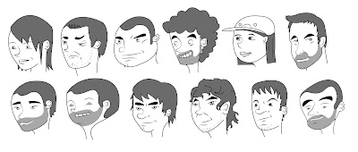
I have been busy a lot lately preparing for the upcoming deadline for Dare to be Digital, however i have been looking at my work lately and seen a lack of personal development. My last couple of pieces of work have been to help develop my skills at using new software and how to paint and colour in new ways to my previous style. I have been looking at how i could better myself in my type of style i have and i came across a blog of a artist who gave out a couple of interesting points. One which i did take into consideration and try was to draw in the style i want to practice people and faces i know well. The blog talked about how you know the faces around you and are easier to picture in your head than random faces or copying off other images, the point made as to draw these people in the preferred style you want to practice. I personally prefer disney/pixar style art with every over the top expressions of shape and characteristics. I chose to have a go and creating this effect by drawing friends as i could picture what they looked like in that style. These are what i drew. I also created them in illustrator to help me again strengthen my skills in that software.

Friday, 23 March 2012
Tshirt competition


I entered a couple entries into a Deviantart competition to design a teeshirt which has a cute monster design on it. You could enter as many teeshirt designs as you like but you had to design your own monsters to add to the design. They gave us the teeshirt templates in which to use when designing the tshirt. Unfortunately I was unable to place in the competition but I enjoyed designing the work and it helped me practice my skills on photoshop. It was also a great way to develop my personal practice as well as get viewers looking at my work.
2D Art and Practicing New Software

To continue my development on Illustrator i developed an creature design. I started with a similar doodle to the first attempted I did and then placed it into Illustrator. I used Illustrator tools to outline the creature to have smooth edges and have vector feel. I then exported the creature out into photoshop for colouring, I spend a while designing this creature because I though it would look goof as a part of my portfolio as well.
Learning Illustrator


As part of my learning aspects for BA8 I said I would have a look and use illustrator. As I haven't used the software before I had to play and test the software first. I doodled a creature in which to use as practice in Illustrator as a way of getting used to different elements of the software. I mostly used the pen tool to outline the creature in Illustrator as well as then used the brush to paint other lines into the image. I saved out the outline of the creature then painted it in photoshop.
New Website Design

I looked back at my old website design and thought it didn't show me personally as a character. Professional websites would be a lot less artistic than this design but i want to get across my character as a person and my abilities rather than trying to push other qualities in which can be seen through my CV and or Interviews, I also feel like its more attracting for a viewer to see rather than a website that may look in a similar style to other designers and artists. Having a site that is rememberable is also important as i have personally heard from a number of designers how because of simple elements on there cv, art or websites have stood out they have got jobs because they are the person the employer can remember.
My idea is to create this site either on Iweb or dreamweaver. I haven't used Dreamweaver before so i will have to learn how to use the software if i am going to use it. I also have heard how Icloud, are no longer going to be avaiable from april, this may effect my using Iweb based on Iweb uses Icloud to host Websites.
Saturday, 10 March 2012
Mummy Enemy

Here is a mummy design for the Egypt level of Nimbo, This creature was designed to slowly walk and eat the plants on screen with its main weakness being wind has it is only held together by the its linon wraps. It will strong agaisnt lightning and ice.
Wednesday, 7 March 2012
Enemy Theme Design

This enemy is for the artic/snow levels, typically a snowman is commonly refered to winter and christmas. Dispite snowmen not being alive also known for attacking or eating plants the comic concept that they are in game should keep players less worried about the practical sence and keep them for focused on playing. There weakness would be heat, and they would have a medium amount of health.
Tuesday, 6 March 2012
Locust

This is a design i did for another enemy for the plants in Nimbo. Locast are known for eating plants and crops which makes them a perfect natural enemy for the game. I looked at real images of the insects to see what they look like in detail so i can make my cartoon version look semi realistic. I will be grouping them together small to they will appear to fly as a group into the level as an enemy. Their weakness would be to wind, though they will have low health anyways being so small.
Catapillar Enemy
Today i thought that a potential enemy for plants could be a small group of catapillars due to the fact that are notorious for eating plants and there leaves, I doodled some designs out as well as worked up a finished version which i think works well in the style and looks fun and amusing.


Sunday, 4 March 2012
Moshi Monsters Music
http://www.telegraph.co.uk/technology/social-media/9119099/Moshi-Monsters-signs-record-deal-with-Sony.html
I came across an article on how moshi monsters has signed a record deal with sony to release an album. This shows how when a game becomes really popular more opportunities egmere, it also means that if the game as many strong aspects they can then be extracted out more such as the sound and music from Moshi Monsters.
I came across an article on how moshi monsters has signed a record deal with sony to release an album. This shows how when a game becomes really popular more opportunities egmere, it also means that if the game as many strong aspects they can then be extracted out more such as the sound and music from Moshi Monsters.
Tuesday, 28 February 2012
First Stage of Plants
Plants will grow through different stages in which players will recieve points from. I am currently looking at designing the flowers themselves but i have designed some level one plants in which players can find on the level before they grow. I have kept them simple and similar in which players will have to grow them before they will be able to tell what plant they are.
Here are the designs:
Here are the designs:

Monday, 27 February 2012
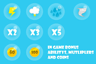
Bonus in game items
In-game players will be able to recieve random bonuses in which will help the player and keep the player feeling that they are achieveing something over long periods of gaming. I already had mentioned and had a couple of different Bonus powers for the older game document, what i have done is expanded on them and created a range in which bonus the player in different ways and different abilitys.

Friday, 24 February 2012
Access to Music
Today i went down to Access to Music in order to colaborate with music students in which can develop a soundtrack for my game 'Nimbo' I went with 4 other students and had to firstly meet at 10 and then give the students and the teacher a brief presentation of what i am doing, what my game is and what i am looking for in the form of a soundtrack. It was a good day out and was able to meet a couple of other students in which seems capiable of making some great soundtracks. After having a good talk and a discussion on what is needed and how they will go about designing the sound i now have to wait to here back from them to see what they have created. This means we will work together again and hopefully be able to communicate strongly to acheive the best outcome.
I am looking forward to what will be created for my game and will continue with my own sound work with recording sounds for voices and attempt creating a soundtrack with another nuca student.
I also spent half the day working as student ambassidor taking tours for new students around the uni.
I am looking forward to what will be created for my game and will continue with my own sound work with recording sounds for voices and attempt creating a soundtrack with another nuca student.
I also spent half the day working as student ambassidor taking tours for new students around the uni.
Thursday, 23 February 2012
Extra Credits
I have been invited to attend a collabiration meeting with Access to Music along with 5 other pupils to get help from professional musicans as well as music students. The idea is that we show our work for BA and discuss how and what music we need and would like for our work and/or showreel in which they would try to experienment and create sounds for us to freely use. This is a great chance to get some experienced artists to create us some great soundtracks and potentially more in which will help us with understanding how to create music.
As i also was going to be creating a soundtrack to use for the prototype of nimbo and the animation this will firstly help learn how to go about the design of the music as well as have some great people create my music (potentially alot great music in which i would of made in the time i have) What i am doing im prepiration is to look at different soundtracks of music in relation to my game, so games like farmville and angry birds and listen to what they include and how it makes you feel.
I also will then try to find examples of songs and sound to take or reference to be able to explain what want from access to music. It will also make me clear of what i am looking for and why.
Farmville soundtrack:
http://www.youtube.com/watch?v=7dF96UFfGrw
Angry Birds Soundtrack:
http://www.youtube.com/watch?v=cZJheq_a-T0&NR=1&feature=endscreen
Tiny Wings Soundtrack:
http://www.youtube.com/watch?v=7afcpk8TV_c
Scribblenauts Soundtrack:
http://www.youtube.com/watch?v=7nCOi1Aflso
Jetpack Joyride Soundtrack:
http://www.youtube.com/watch?v=6LfIh8Cqu8s
I have also re-watched Soundworks Video on Angrybirds in which i watched earlier durin my project. The video is helpful and shows how the song in which is now many started as a simple catchy beat in which has been modifided in many ways to create different good soundtracks.This would be good to get a catchy beat or noise in which people will remember and reconize after playing, even potentially get stuck in there head.
I like the feel and sound of country and folk music on the acuostic but i feel like that it will nimbo feel to country rather than bubbly and fun, hopefully finding a compromise will between a digitalize sounds with country or folk.
Monday, 20 February 2012
Credit Design
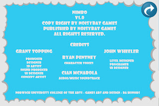
I completed the Credit and information screen today labeling simple information about the game as well as the credits for who has done what currently for the prototype of the game.
Shown here:
I have also talked to Cian McNabola in which to discuss music and audio for nimbo. My though on the game was that it could have a light acustic sound which could play quitely in the background of the main game as well as maybe the menu screen.
I also designed a potential loading screen for John incase needed, it also makes the game feel more complete and have the components that other Iphone games have. Here is the loading screen design:

The idea was that this screen would appear after the logo screen, this screen shows the game name, character and each small bubble cloud below the name would pop up as the game loads. When all three appear the game has loading and the menu would appear shortly. the first cloud would appear at 25% loaded, then the next at 50% and then the 3rd at 75%.
Shown here:

I have also talked to Cian McNabola in which to discuss music and audio for nimbo. My though on the game was that it could have a light acustic sound which could play quitely in the background of the main game as well as maybe the menu screen.
I also designed a potential loading screen for John incase needed, it also makes the game feel more complete and have the components that other Iphone games have. Here is the loading screen design:

Sound Design and Credits
Today i spend looking at making sounds for my game concept 'Nimbo'. I wanted to create buttons sounds and a simple voice sound in which to use potentially in the game demo in which is being put together by john. I started today working in sound looking at loops and prerecorded sounds in Logic in which i can use and edit for the button noises, after playing around changing different sounds, cutting and whiching noises i was unsure of what would work for my game in terms of sounds. I had a strong idea in which i want Nimbo to sound (squeeky and young). With my loading opening screen i thought i could have someone voice over the word nimbo telling players how it sounds and people wil understand the cloud as a child.
I recorded Ryan Pentney preforming the voice saying nimbo in which to use. I like how it turned out although i may have to test it with john and get other oppinions of the sound. From this sound i thought that some buttons may have voices in which say words rather than simple typical button sounds. Because of nibmo moving as a anamatic for the menus i recorded 'Here we go' as the sound that could be used for the items, play and buy buttons because it will look and sound like nimbo is moving to the next area.
I also got some simple mummbled versions of nimbo and nimbos fathers voice in which i could place over the speech bubbles during the simple introduction anamatic.
Saturday, 18 February 2012
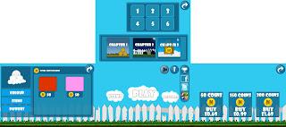
First finished menu Design
I have spent the last couple of days designing the different menu screens as one image in which should be in the correct size and format to be transfered to gamesalad. I had to design many different layers and elements to create buttons and elements to make it appear strongly refined. I will take this to john and see what he can do with the assets and hopefuly create a really good working animated menu.

Thursday, 16 February 2012
Menu Design
After meeting with john again to discuss how to create layout for the menus in design to fit gamesalad and potential Ios devices. He had designed a new way of animating the menu design, orginally i was having the menus appear over the last when buttons are selected but john learnt that if a large screen image was designed it could be anmaticaly moved which would give the apparence of sliding menus. This in the demo form looked more orginal and exciting than appearing menus. He also intergrated the concept of nimbo being on the main menu by making nimbo move to the other menu screens through animation. The prototype shows a box move from one secton to the other but when the character is added it would appear like he is flying from one menu to another.
Video of demo menu in gamesalad created by john:

Video of demo menu in gamesalad created by john:
Monday, 13 February 2012


Thursday, 9 February 2012
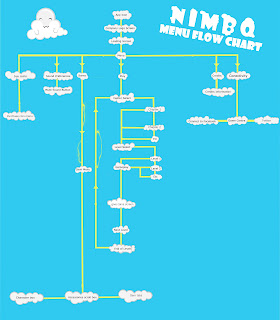
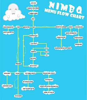
Flowchart Edit
This is my updated flowchart:
I also have spent my time designing my own personal company name and logo to make the game have a feel of realism, as it will look like a company has made the game.
Design:
Because i am designing the game and creating the assets but john is creating the playable game i have asked if him if he has a company idea or logo in which he has. I will also be adding his logo next to mine to show that is was a joint effort in making the game.

I also have spent my time designing my own personal company name and logo to make the game have a feel of realism, as it will look like a company has made the game.
Design:

Because i am designing the game and creating the assets but john is creating the playable game i have asked if him if he has a company idea or logo in which he has. I will also be adding his logo next to mine to show that is was a joint effort in making the game.
Wednesday, 8 February 2012
Flow Chart edits
After getting in touch with john, he was happy to continue working on the Nimbo prototype. He is happy to have a least a simple full level working prototype which may include menu's and buttons to navagate. This would allow me and him to both show a working game as well as show that we have the ability to create a product.
We sat to discuss what i am currently doing and were i am up to in the re-design of the game document. One main topic was the menu design in which i have started to draw out. John had a look at the flowchart and pointed out different ways i could improve the flowchart to make a more practical design in which could be made by him as well as general observations. I took his advise and we looked at how improve the design in which worked for me and for him.
this is the image we worked on in context of redesign, the red indcates changes i could and should make:
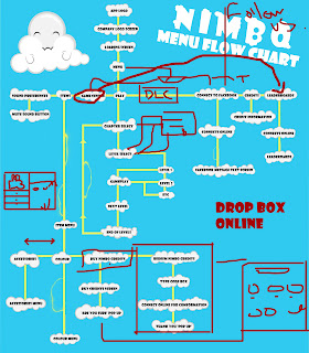

Sunday, 5 February 2012
This is my first attempt at the design layout of my potential menus for Nimbo. I created it in theme with nimbo to make it more presentable as well as trying to keep practical and simple.
After getting some feedback from other students and teacher there were a few adjustments that would make it more understandable and readable. The lines needed changing to understand the direction as well as what it on what menu. I also changed the text to make it more plesant to the eyes and readable. This is the updated version.
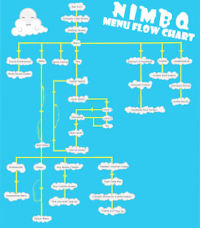

After getting some feedback from other students and teacher there were a few adjustments that would make it more understandable and readable. The lines needed changing to understand the direction as well as what it on what menu. I also changed the text to make it more plesant to the eyes and readable. This is the updated version.

Saturday, 4 February 2012
Menu layouts
As i am currently designing and painting environments for my game refining the art style and look i was thinking what i could design for the game menu's. During resent sound inductions i have been thinking about hopefully using and recording sound to get some early practice and i thought having a quickly animated menu system might be worth trying soon so i can try using sound. Firstly before i can design my menu screens i must know the layout of how my menu system will work. This would take the form of a flowchart, to enable me and others to see were the different screens lead on from each other. As early preparation for this i have had a look at games on the Iphone to see how they have laid there game menu's out. There is a recurring theme with similar buttons on the main screen as well has similar looking buttons and layouts.
Brief notes made by me:
Angry Birds -
Click Gamer - Revio - Loading screen image - Menu screen
Play - settings and credits/info - leader boards - Achievements - buy eagle - connect to online.
Play - Chapters on scroll - levels - Pick level.
Jetpack Joyride
Half-brick loading - menu screen
Play - stash - missions - home - leader board - connect to Facebook.
play = play.
stash - clothing, jet packs, vechicles, utilities, profile, achevements, get coins, also shows total coins on this page.
Mega Jump
Get set - Play - Free MP - Store - Facebook - Twitter - Youtube - Mega Code - Help - settings
Settings - faint, game centre - sound - screen.
Store - Characters to buy - Buy star - wallpaper - buy coins.
Play - Level
Minigore
Loading screen image
Play - Options - Leaderboards - Achievements - Communities - Credits - Encyclopaedia
Play = Choose character - play
Options = Music, SFX, Voice, Show Pads, Show Radar, Game centre.
Encyclopaedia = Images of different characters and enemies.
These notes are for my to remember how these games have laid out there menu screens, I will look over these games and others again when i design my flowchart of the menu system. I will also look at how games have also used mechanics to save space on menus as well as the artist direction and the typical layouts of menus in the iphone.
Tuesday, 31 January 2012
Nimbo Coins

I did a series of designs looking at what would be the best design for the credits players would receive in game. I made a different series of designs to see what would visibly look best but i also had to consider what credits might look like as they tend to have the iconic coin look and i didn't want to confuse players to what they are. I like the seed design along with the Numbered leaf and Numbered Gold coin, i feel like the coin is a great way to make players already recognise that it can be used to buy items. The seed design shows money and might inform players that it needs to be bought with real world money.
I think that i will be using the coin due to its iconic look and that having a number on the coin i can then make it a way to showing how much an item can cost as well as use the N gold coin as a base for a totalled number of coins players have earnt. I can then add in a way of making players by numbered coins showing there value.
Subscribe to:
Comments (Atom)