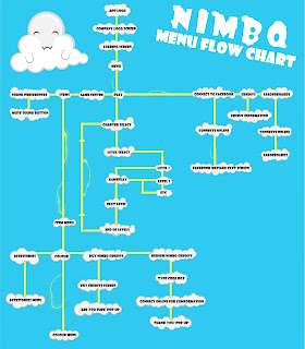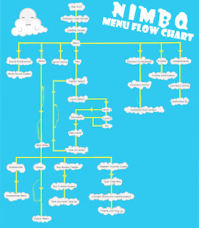
After getting some feedback from other students and teacher there were a few adjustments that would make it more understandable and readable. The lines needed changing to understand the direction as well as what it on what menu. I also changed the text to make it more plesant to the eyes and readable. This is the updated version.

No comments:
Post a Comment